It's week eight of the One Room Challenge and if you have been following along on my instagram or titok you would have seen the (sometimes chaotic) updates leading up to this reveal. If you are totally new to this, the One Room Challenge is an eight week program hosted by Apartment Therapy for a community to come together and re-design or decorate a space in their home.
You can see the other particpants beautiful finished projects here- ONE ROOM CHALLENGE SPRING 2023!
I thought we'd start this reveal with a super casual photo of my family in the finished space...you know the kind of casual that involved being in-bed-in-my-dress-with-a-full-face-of-makeup . (Also, I just really wanted an excuse to share this family photo because my partner and dogs are just too precious). All the photos featured here are by the amazing Chelsea Mudlo of CMudlo Photography in San Diego, CA.

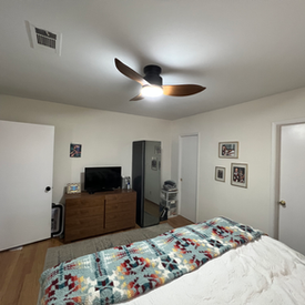
Alright, now that we got that out of the way, I need to share with you the "BEFORE" photos of my space. As a professional interior designer, I was a little nervous to even share this publicly on my work website. The truth is though, when you do this for a living, your own home often times gets put on the back burner. It's the age old saying of "The cobbler has no shoes", or in this case, a designed space. We bought our first home in the height of the pandemic and life was moving a million miles a minute. We got our stuff put in and kept thinking we would eventually get to it...finally, almost three years later- I got to it!
There is an LG Styler (one of my favorite appliances ever) in the middle of the bedroom (this now lives in our closet), the walls are completely sterile white, and we tried masking our broken 1955 original window with curtains. For lack of better terms, this room had no sense of soul. Our stuff fit, and it was a safe place for ourselves to sleep...and that is about it.
When I started the remodel, I knew I wanted to change how I felt about my bedroom. In design school we spent an entire semester on color theory and how colors can help change the way our brain processes our environment and our feelings. The primary bedroom was always going to be our safe space but it needed to also be a place to recharge, feel inspired, cozy, and full of dreams. To do that, I found that I wanted a statement piece. The GARDEN STATE Mural Wallpaper by Milton and King did just that for me. It was a mural originally painted by Australian based multi disciplinary artist, Tiff Manuel. Tiff brought so much energy and light into her drawings and it was the starting point on our blank canvas. I was able to then use the colors in the wallpaper to choose the rest of the colors in my room. Lucky for me, this particular print had SO many options. From the accent pillows, bed sheets, rugs, and more- everything was hand matched and selected from here. You can check my other post for a more in depth analysis on the details of the wallpaper as well as the installation.

Once I had that, I knew I wanted an accent color to pop with the wallpaper, my friends at Dunn Edwards Paints helped me select two colors for the room. We did Perfect Plum and Summer Shade and added molding to create a trim around the lower half of all the walls. I realized quickly though that I couldn't stop the Perfect Plum with just the lower half and ended up painting all three doors and all the base boards the same color. The end result felt SO cohesive and made the space feel truly finished.

With the big ticket items like the wallpaper, molding, and paint done- it was time for all the fun details! We kept the original plain flat doors in the room but I knew that some good hardware could really make them stand out. Emtek makes all sorts of beautiful hardware but this might be my favorite piece ever. I saw them at KBIS and knew I needed them in my home one day. If you are newer here, you might not know my family background. I grew up in the natural stone industry and marble surrounded my life growing up. My parents were distributors and I grew up going to marble quarries and cleaning samples for customers as a job in high school. When I saw the Conical White Marble Knobs, I knew it was meant to be. It was an ode to my family and memories of my youth...and it was GORGEOUS.

Another detail that really brought my entire space together was two accent pillows. They are from Mackenzie Childs and had the most detailed coloring and beading throughout the pieces. I used two from their collection the Cockatiel Pillow on our bed and the Leopard Lumbar Pillow on our accent chair. We finished the detailing with a yellow basket weave throw blanket from them as well.


I realize my room isn't huge. Our house is a 1955 mid century modern in one of the older neighborhoods in San Diego. It is however, perfect for us. Remember what I said in the beginning about color theory and our moods? We've been sleeping in the finished space for a few weeks now and it is drastically different in energy. I know that statement sounds a little "woo-woo-y" but its true! There is something about waking up and seeing the bold floral prints and having the warm colors of the bedding and prints that makes me feel both calm and energized at the same time. We also finally replaced our window with a double pane XOX window that locks! We got a new window covering that lets in a ton of light and it's exactly how I always dreamt it to be!


Opmerkingen